- Create a new table for each topic. Add a heading, then follow with the table.
- Do not try to join tables together by adding titles under rows that contain content. Instead, create a new table with its own heading.
- Do not merge multiple columns or rows, this will cause an error in the way it displays on mobile devices.
- Do not create cells within cells.
- Do not vary the number of columns in a single table.
- When adding prices for even numbers like $6.00, de-clutter by writing it like this; $6.
Creating Tables
Tables are designed to automatically reformat to fit small screens, such as tablets and smart phones. Here's an example of how a table, viewed on a desktop (left), transforms to appear as a list on a smart phone (right).
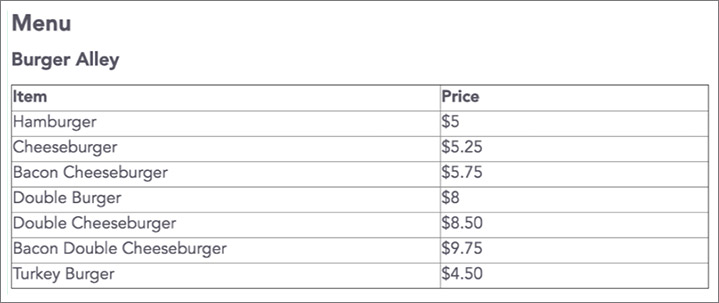
Tables are especially useful for menus, Outdoor Rec equipment and service/price listings. Text in tables remains a readable size, even when viewed on a tiny mobile phone screen. PDFs are typically unreadable on small screens and should not be used as substitutes for tables.
Tables must be built using the Tables tool
You cannot copy and paste a table from Word into a content block. It will not reformat properly when displayed on a mobile device.
Create a Table
1. In a Content block, add the heading/title before you start the new table. If a heading is not needed, you don't have to add one.
2. Click the Editing (pencil) tab in the upper-left of the dashboard to enable Editing mode.
3. Place your cursor where you want the table to start. Click the Table tool.
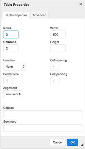
4. In Table Properties, add the number of Rows and Columns needed. Ignore all the other settings. Allow one additional row to be able to add titles. Ignore all other settings. Click OK.
5. Add content
Remember that the top row is the title row. It contains a mechanism that will automatically reformat the table to a narrow mobile screen. The system automatically “bolds” the text in the title row.
Titles must coincide with the content below them on each column. All rows/cells below should only have content.
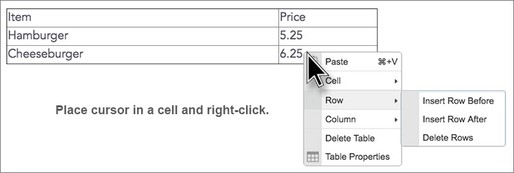
To add or delete a row or column, right-click inside a cell.
Tips:
Incorrect Table Structure
This example shows how an incorrectly-structured table does not reformat itself to a small mobile screen. It may look fine on a desktop, but the information gets jumbled when viewed on a mobile device.
Here's what went wrong...
- The headings -- PRICE LIST, SOUTH FLORIDA -- were inserted into the table. Not above/outside.
- The content rows don't fall directly under the title row.
- The text is not all flush left.
