- A newcomer in the barracks may want to meet people and get away for a weekend of sightseeing and adventure.
- Parents need to know about local schools, youth sports, etc.
- Auto Skills customers will want equipment lists and information about work bays.
- Everyone eats! Provide restaurant menus to help them choose where to go.
- When adding slide shows, keep it to 4 images max. They slow the rate at which your pages load.
- When using Flickr sets, use only the best images and don’t add too many. Select photos with a large focal points because the thumbnails will be very small on a mobile phone screen.
- Say a facility name once on a page. If the facility name appears on the page heading or at the start of your text, don’t keep repeating it.
- Don’t repeatedly state the name of the garrison. If a user is in the Fort Bliss website, they already know that what they’re reading about is at Fort Bliss.
- One is enough. More than one is an amateur’s mistake.
- Not every sentence in your text qualifies as a rah-rah cheer. Use them when something truly deserves enthusiasm.
- The ideal standard is no more than 20 words per sentence, five sentences per paragraph.
- Use dashes instead of semicolons.
- When using a long dash — add a space between the line and the word.
- Use bullets to break out details.
- CONUS: +1 (XXX)xxx-xxxx
- Europe: +49 (0)XXX-xxxx-xxxx
- Italy: +39 (XXXX)-xx-xxxx
- Japan: +81 (XX) xxx-xxxx
- Korea: +82 (0)XX-xxxx-xxxx
- Add a space between the numbers and a.m./p.m. Example: 11 a.m. | 1 p.m.
- Use a colon to separate hours from minutes. Example: 10:30 a.m. | 6:45 p.m.
- Use "to" for time spans. Example: 7 to 11 a.m. | 10:30 a.m. to 3 pm.
- Do not capitalize hyperlinks.
- When creating an internal hyperlink use the _self window option
- When creating an external hyperlink use the _blank window option
- If a link has a file extension write the link as follows:
- The Web Team will test your site, read your content, check your meta data and verify that your structure is correct.
- If corrections are needed, you will have one week to finish them. Major corrections are allowed two weeks.
- When your site is perfect, we will do a final check and launch you live.
Writer's Guide & Standard Formatting
Write to Sell!
Read this guide before starting work in your website. Observing these rules will minimize corrections and revisions before your site is approved for live launch.
Writing for the web is not the same as writing for print.
People read differently online than they do when they read print materials. Web users scan for information. People typically read only 20 to 28% of the words during an average visit.
Don’t mindlessly copy-paste and think you’ve loaded successful content.
Even well-written text from magazines and brochures must be edited to web-writing style. Write well, use ordinary language and keep it short.
Write to inform, not entertain.
Use what limited space and attention span you have to deliver meaningful information. Be direct and friendly. Don’t waste words on fluff or ask silly questions like “Do you like to swim?”
Think like a customer.
Ask yourself what questions and needs a customer might have and how MWR services can answer them.
Front-load the important information.
Start with the content that is most important to your audience, then continue with additional details.
Evaluate whether information is needed and appropriate.
Website content should inform viewers about your events, programs and facility offerings. Use a writing style that's welcoming and friendly. Policies and lists of rules, such as hunting and fishing, can be tucked into an accordion.
Appropriate use of PDFs and JPGs
PDFs and JPG images of menus, flyers and informational graphics cannot be added in place of text.
Visiblity: The Enterprise Web (EW) is a responsive system. It’s designed to automatically reformat your content to different screen sizes your customers use. If you add a flyer graphic to your webpage, it may look fine on a large desktop monitor but, the image will shrink down to mush on a tiny mobile phone screen.
Searchability: Web browser search engines use plain text to seek the information a user wants. If you place a flyer JPG of an event on your website, it will not appear when someone does a Google search. The text blocks under images can be easily read on any size screen and is searchable.
PDFs can be added as linked documents along with your web content. This is a good way to include multi-page catering brochures, newsletters, policies and information that should be printed out or viewed on a large desktop screen.
Restaurant menus and equipment price lists should be added in tables. Tables automatically reformat and are easy to read on small phone screens.
Exceptions to the rule: Documents that have lots of tiny details may be best-used as a linked PDF. Examples: a month-long calendar of restaurant daily specials or, lists of sports tournament scores. The PDF lets people print out the page and post it on bulletin boards, home refrigerators, etc.
This shows how PDF and JPG flyers look on a mobile screen. Tables automatically reformat for easy reading. 
Think carefully before loading slide shows and Flickr sets
Use them only if they will have meaning for your viewers. Slide shows and Flickr photo sets have value as entertainment and decoration — not information. They don’t allow you to add a caption to identify what the photo is. Unless photos are identified in nearby text, they will be meaningless to your viewer.
Content Organization and Structure
Consistent formatting is important. Every page in your site should look like all the others.
Order of Blocks Inside a Facility Page
All facility pages must follow this order for blocks when applicable:
1. Hours of Operation and Contact (main facility—Add to Main)
2. Content blocks (program or facility content—Add to Info)
Here's a properly-formatted facility page 
Chunk your content. Chunking makes your content more scannable by breaking it into manageable sections. Use short paragraphs and add an extra space in-between. Use accordions to group information by topics.
Proofread critically; edit without mercy. Always look for ways to keep content short and concise.
Use white space. Using white space allows you to reduce noise by visually separating information.
Don’t waste space by adding extra spaces (returns) between blocks of content. One or two is enough. Extra space adds length and causes viewers to scroll endlessly.
Say the name of a facility once in a paragraph. Then use “we” and “you.” Like this:
Java Café is a delicious way to start your workdays. We serve all your coffee favorites, fresh-baked muffins and scones. We also offer lunchtime sandwiches and delicious salads.
Don’t repeat information.
Read what you write. This is an actual submission of content the Web Team received when an MWR requested a final review. Poor writing will keep your site from going live.
Don’t repeat event titles in graphics or overlays when it appears in text underneath. Overlays are intended for when you need a quick note like, "Space is limited!"

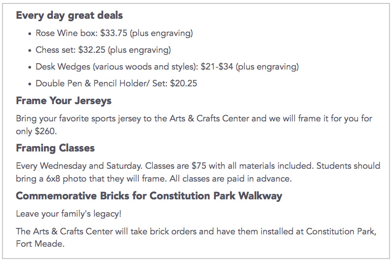
Use bullets and numbered lists. They’re not just for long lists—one sentence and two bullets are easier to read than three sentences.
When writing lists, don't capitalize every word. Caps are meant for proper nouns (names of a person, place or thing).
Here’s an example of a good list. Notice that bullets like "15 suspension lift bays" are all lower case. That’s because they are just things — not actual names or titles. Then, note "Mitchell on Demand" reference library; "Mitchell on Demand" is the name of the book series and warrants caps.

Meta data is important!
You must include meta data when adding events and images. Metadata are keywords and tags that help web browsers search and find your website information. Keywords are also needed when you load images into the File Manager. They’ll help you search for images to add to your web pages.
Effective Web-Style Writing
Be careful with slang and contemporary phrases. Your website content should be timeless. Popular words and phrases may sound fine on the day you write it but, over time will sound outdated.
Be careful of words that have multiple meanings; Cheap, Sick, Hook-up, Stash
Sprinkle your text with keywords. Keywords are clues that web browsers use to search for your information. Write text that uses words people will probably type in when Googling your website.

Text Formatting
Consistent formatting is important. Every page in your site should look like all the others. EW offers 5 heading style choices.
Heading 1
Heading 2
This is used for main headings on pages; for facility names and major titles. There should only be one instance of H1 on a page. Use it to lead new paragraphs as section titles.
Heading 3
Heading 4
Heading 5
For sub heads and to start new topics.
Normal – is the choice for body text. You can also use bold as titles, to start paragraphs, or draw attention to words and phrases.
Control spacing between sentences and paragraphs. If you want less space between content, versus a full-paragraph break, do this:
1. Put your cursor where you want to break.
2. Shift + Enter.
Do not use “&” in place of “and” in body text. It’s OK to use “&” in tables and when space is severely limited. Never use “+” in place of “and.”
Use number-digits in text, not the word.
- Do this: Our campground has 10 RV sites, 5 rustic shelters and 20 tent sites.
- Don’t do this: We have ten (10) RV sites, five (5) rustic shelters...
Do not write text in all caps. It looks like shouting and is impolite.
Do not go overboard on exclamation points!
Stop writing FREE in all caps.
Use short sentences and paragraphs. No run-on sentences!
It’s ok to start a sentence with “and,” “but,” or “or” if it makes things clear and brief.
Do not bold entire paragraphs. Use bold text as subheads and ways to highlight topics and draw the eye. Here’s a nice example:
Bold text can act as an in-text heading to kick off a new paragraph.

Webpage Structure Standards
Everything gets flush-left. Text, headings, everything. Center text only when it helps with reader comprehension (rare).
Text in tables is automatically set to flush-left, align-to-top. You can override the text to center if needed. Flush-left text is always easiest to read.
Standard sizes for images is 750 x 421, 72 dpi. Absolutely no exceptions. Alternate sizes do not reformat properly to mobile screens. If you do not have a photo editing program like Photoshop, use Pixlr to size and crop your images.
Format commercial phone numbers correctly. Correct formatting lets smart phone users tap the number to automatically call. Use this format everywhere, including in body copy. These examples appear as hints when you add phone numbers to your pages.
Include DSN numbers. Army members transitioning to your installation may need to call your facilities using a military phone. DSN numbers are not optional. You must include them.
Hours, Dates and Times
Hours of Operation: Two rules apply.
This format is automatically-generated for the Hours of Operation table.
We use Associated Press format in headings and body copy.
Times
Avoid redundancies:
- Right: 10 a.m. or 10 p.m. Monday
- Wrong: 10 a.m. this morning, 10 p.m. tonight, 10 p.m. Monday night.
Use figures except for noon and midnight. 12 p.m. is Noon and 12 a.m. is Midnight. Examples:
- The New Year's Eve Party is from 7 p.m. to midnight.
- The New Year's Eve party ends at 12:30 a.m.
- Lunch will be served at noon.
- Lunch will be served at noon and the meeting follows at 12:30 p.m.
Time Zones
Include a time zone only if your event/program is relevant to people in other time zones. Like this:
- 9 a.m. EST | 1:30 p.m. CST
- Noon and Midnight do not need time zone indicators such as EST/CDT/MDT, etc.
Dates are written Weekday/Month/Day/Year. Write the entire word for the day. Abbreviate months.
- Saturday, Jan. 1, 2016
Prices in Lists and Tables:
Streamline prices by eliminating unnecessary decimals and figures. Prices appear lower without .00.
- Right: $25
- Wrong: $25.00
Use the appropriate currency symbol.
Copy/paste symbols and special characters from this page.
Prices in headings and body text:
Do not write prices as words. Use the dollar or foreign currency symbol and necessary numbers. Omit the decimal and cent 00s.
Examples:
- Save on ski passes this winter at Outdoor Rec. Season passes usually cost $79.99 at the mountain. We sell them for just $69.99 — A $10 savings. A family of 4 can save up to $40.
- A 4-day theme park ticket to Disney World costs $85.25
- Admission to the Heidelberg Wine Fest is €20
- Tickets to London's Royal Observatory Greenwich cost £9.50
Prices with symbols:
Do not write the word, "dollar" and "cents". Use the $ / ¢ character. Do not add a space between the symbol and number. Use the Special Character function for ¢.
Copy/paste symbols and special characters from this page.
Examples:
- Right: Season passes cost $25.
- Wrong: Season passes cost 25 dollars.
- Right: Hot dogs cost 75¢ each.
- Wrong: Hot dogs cost 75 cents each.

Hyperlinks. It’s not necessary to add words like “click here” when there’s a link. By now, people already know that blue text indicates a clickable link.
Help During Production
The Web Team is here to help. Contact us any time you need assistance and have questions.
Recommended Interval Check Ins:
1st — After you’ve completed two Facility Pages and one event
2nd — Midway, to assure that you are formatting correctly and to address special concerns.
3rd — Close to final production, give us a call or email to tell us your progress.
4th — Final Review, when you are complete and ready to launch.
Marketing Directors must stay engaged during website construction and review all content before asking for a final review.
Proofread and test every link!
Do not ask for a final review until you have thoroughly proofread and tested your entire website.
Final reviews are in-depth and take time. Allow 2 weeks.